
 All work
Identity & digital experience
A distinctive point of view.
A system to carry it.
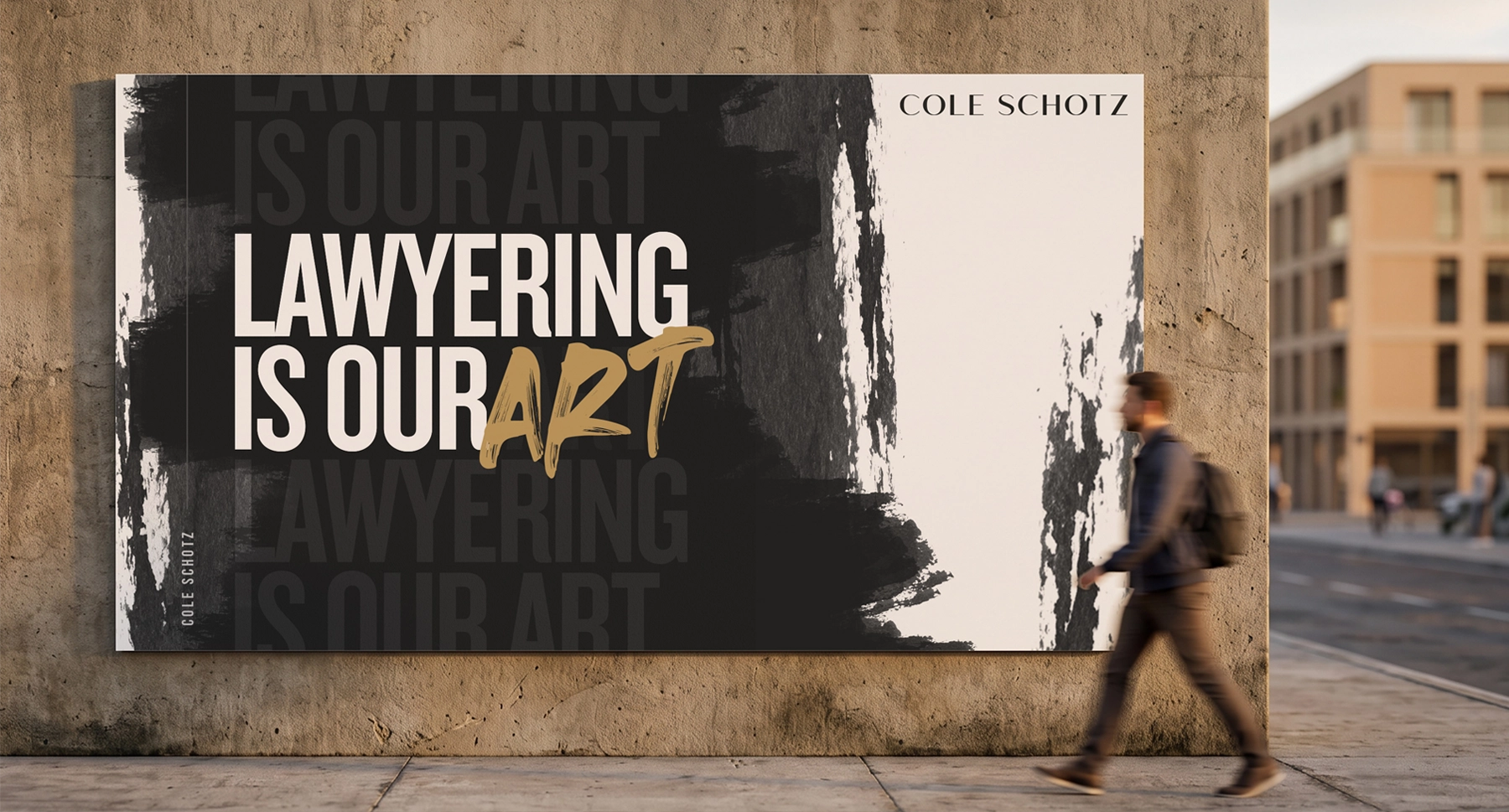
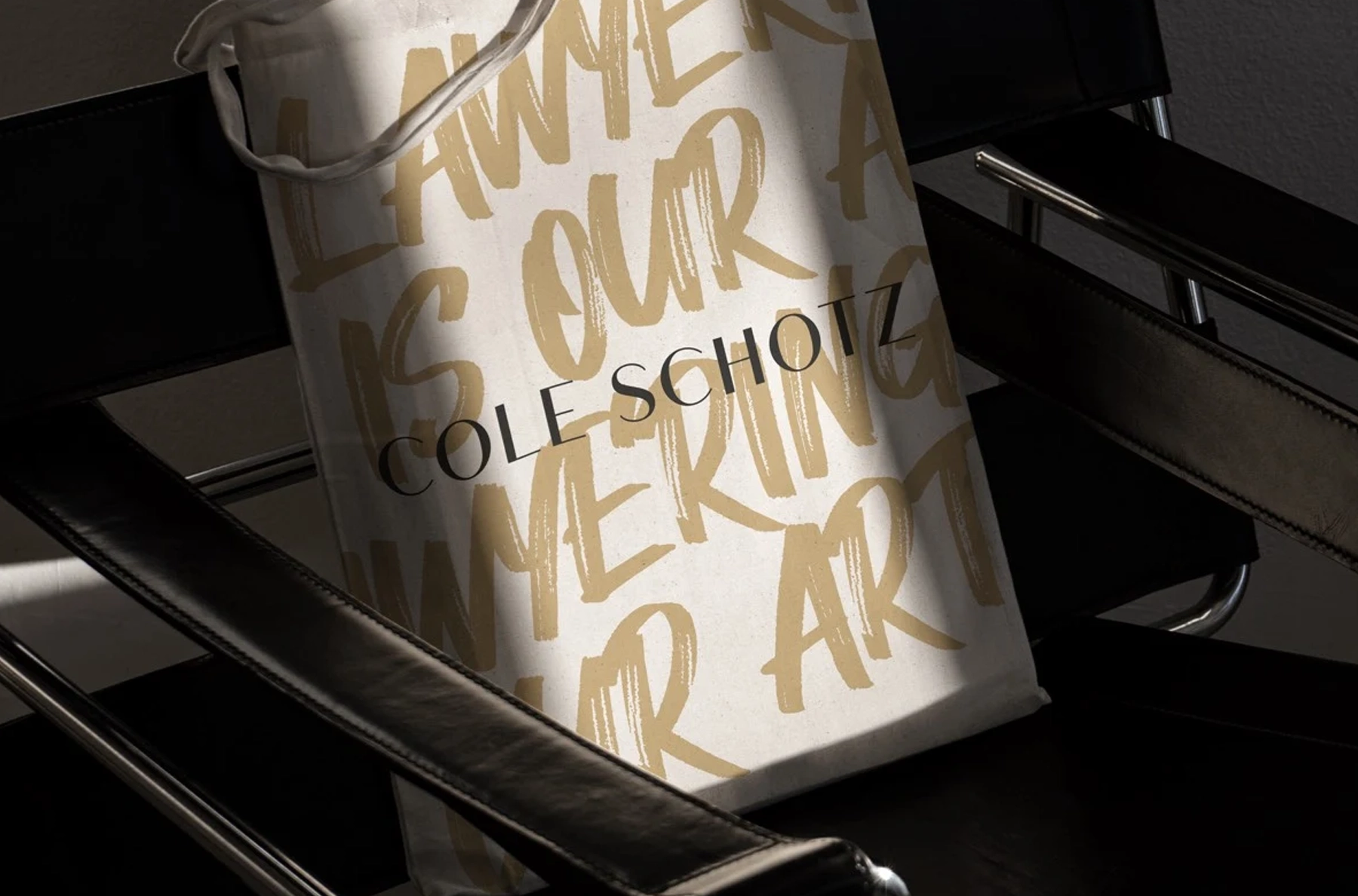
At North Street Creative, I worked on Cole Schotz from brand creation through website design and QA. The opportunity was to give a law firm a recognizable visual voice, then carry it consistently through the places clients and colleagues encounter it: its website, printed materials, presentations, and everyday communications.
The idea
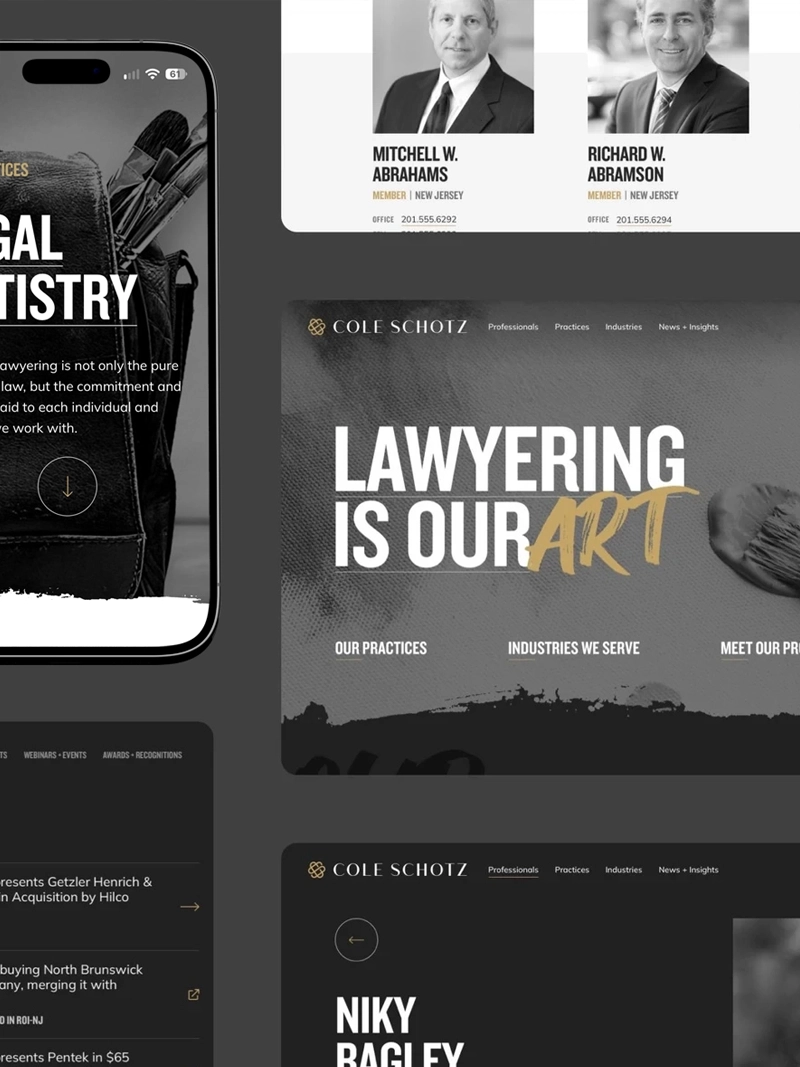
The firm already had a strong proposition: “Lawyering is Our Art.” The design needed to make that proposition visible without compromising the clarity expected of a professional-services business.
Working within the North Street team, I developed the identity into a visual language that could move between expressive moments and practical information. The tension between the two became useful: a bold first impression, followed by a clear structure for understanding the firm.
The system
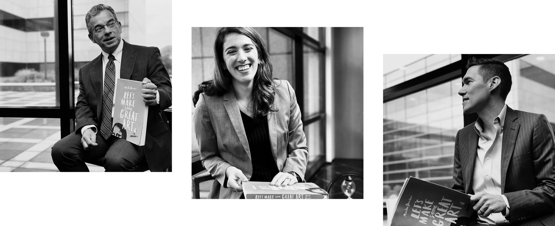
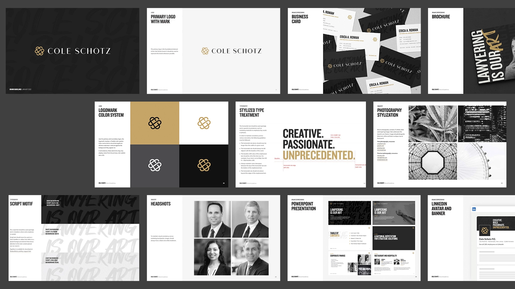
Brush textures, emphatic typography, black-and-white imagery, and restrained gold accents give the work its character. The guidelines bring those elements together, establishing a consistent vocabulary rather than treating every application as a new design problem.
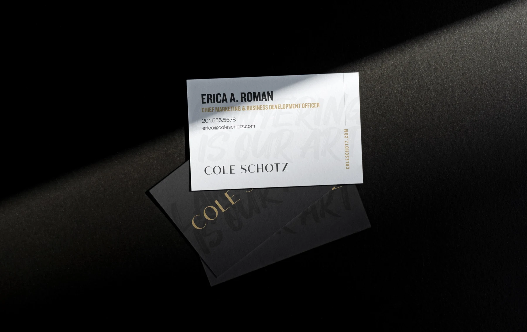
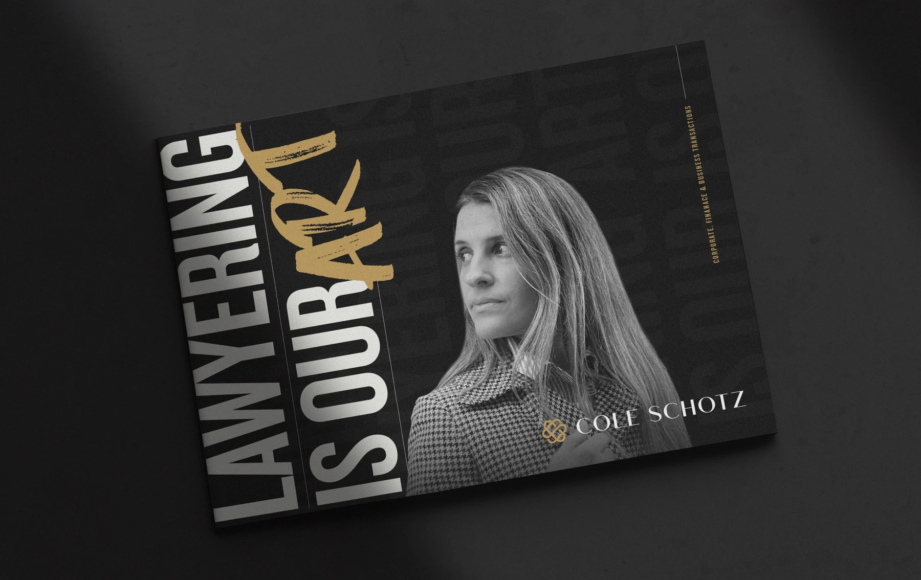
I built out the identity across a range of formats. A business card asks for restraint, while a brochure or presentation can carry more of the visual story. Keeping those expressions related was as important as making each one work on its own.
The digital experience
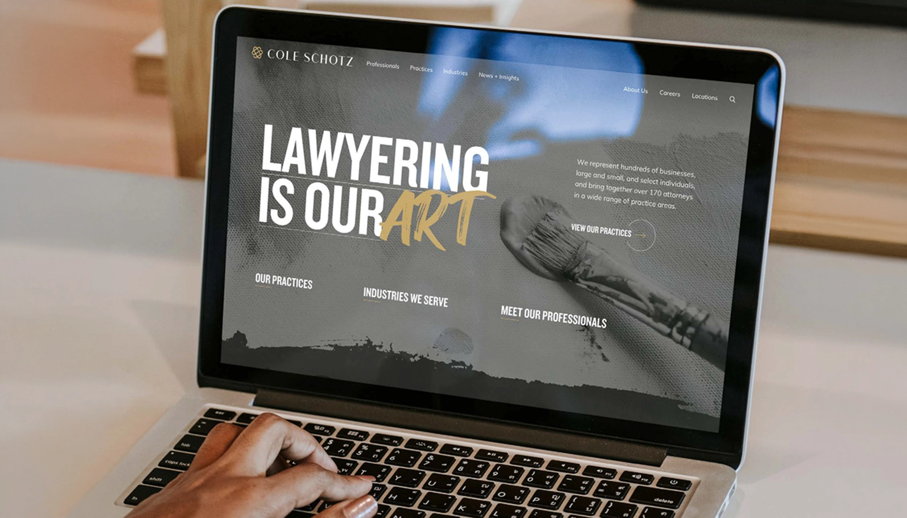
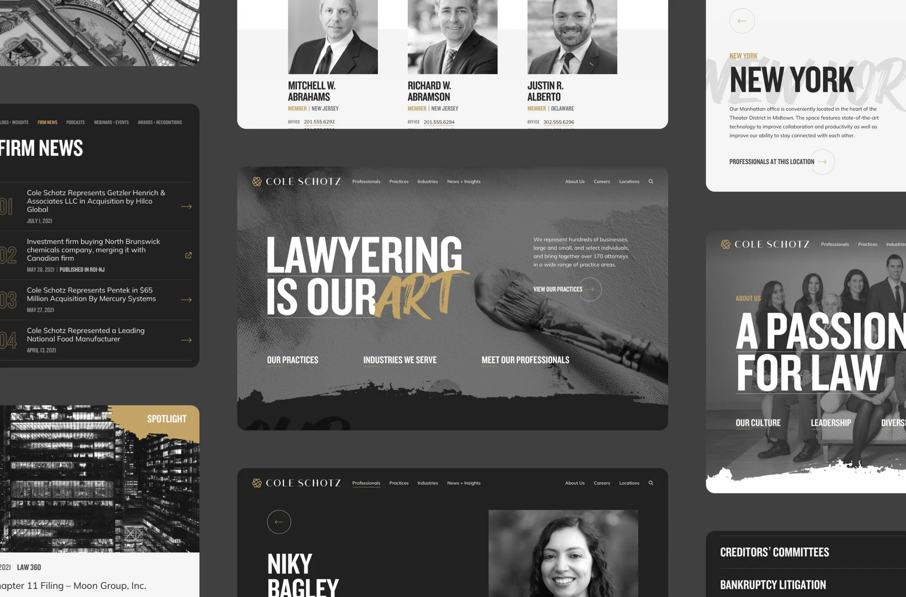
The website had to make room for the people, expertise, and breadth of the firm. I carried the identity into the interface, balancing distinctive brand moments with clear paths to attorneys, practices, and locations
My contribution continued through QA. That meant staying involved as the visual direction became a working website, reviewing pages and interface details rather than treating the design handoff as the end of the project.
Beyond the website
Presentation layouts, printed materials, and everyday objects extend the same language beyond the screen. They show how the system can adapt to different content and levels of formality without losing its identity.
The result is a brand system that can move from expressive moments to everyday tools without losing its point of view.
Project background
Brand, website, and collateral work created at North Street Creative. Strategy and development were collaborative agency contributions.
Next project
All work
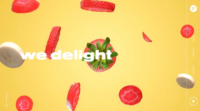

Personality in the foreground.
Clarity underneath.
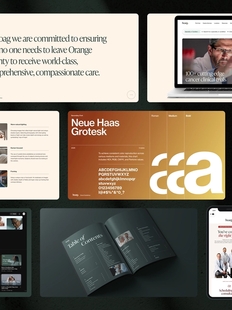 Brand System
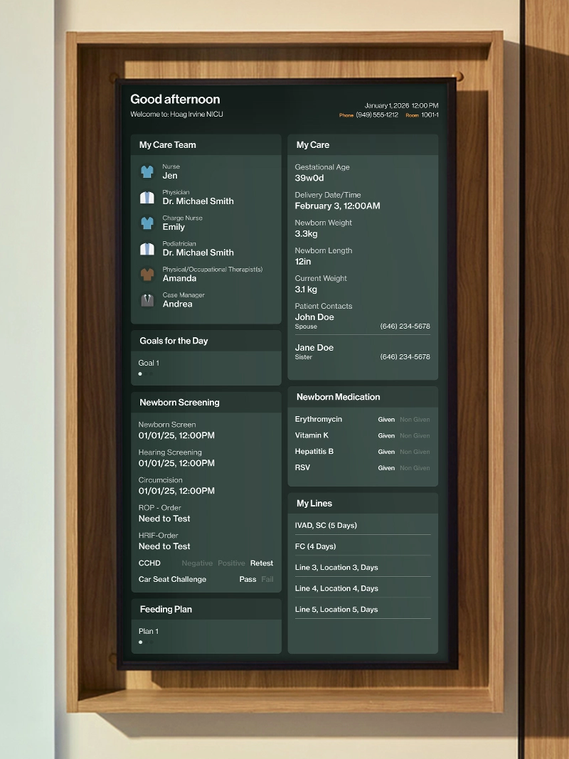 Brand Experience
 Identity & Digital