
 All work
Enterprise brand system
A shared identity.
A system for the whole enterprise.
At North Street Creative, we rebranded Pretium while retaining its existing logo and typefaces. I developed the broader visual system across its website, guidelines, and everyday business tools, then led its rollout to hundreds of employees.
01 / The visual foundation
Pretium's work spans different investment strategies, operating businesses, and audiences. The brand needed a coherent expression that could carry that breadth, from an introduction to the firm to a detailed report.
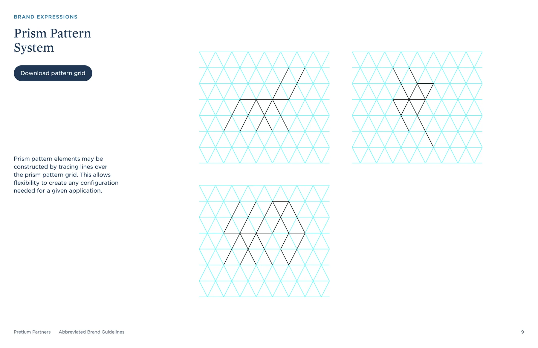
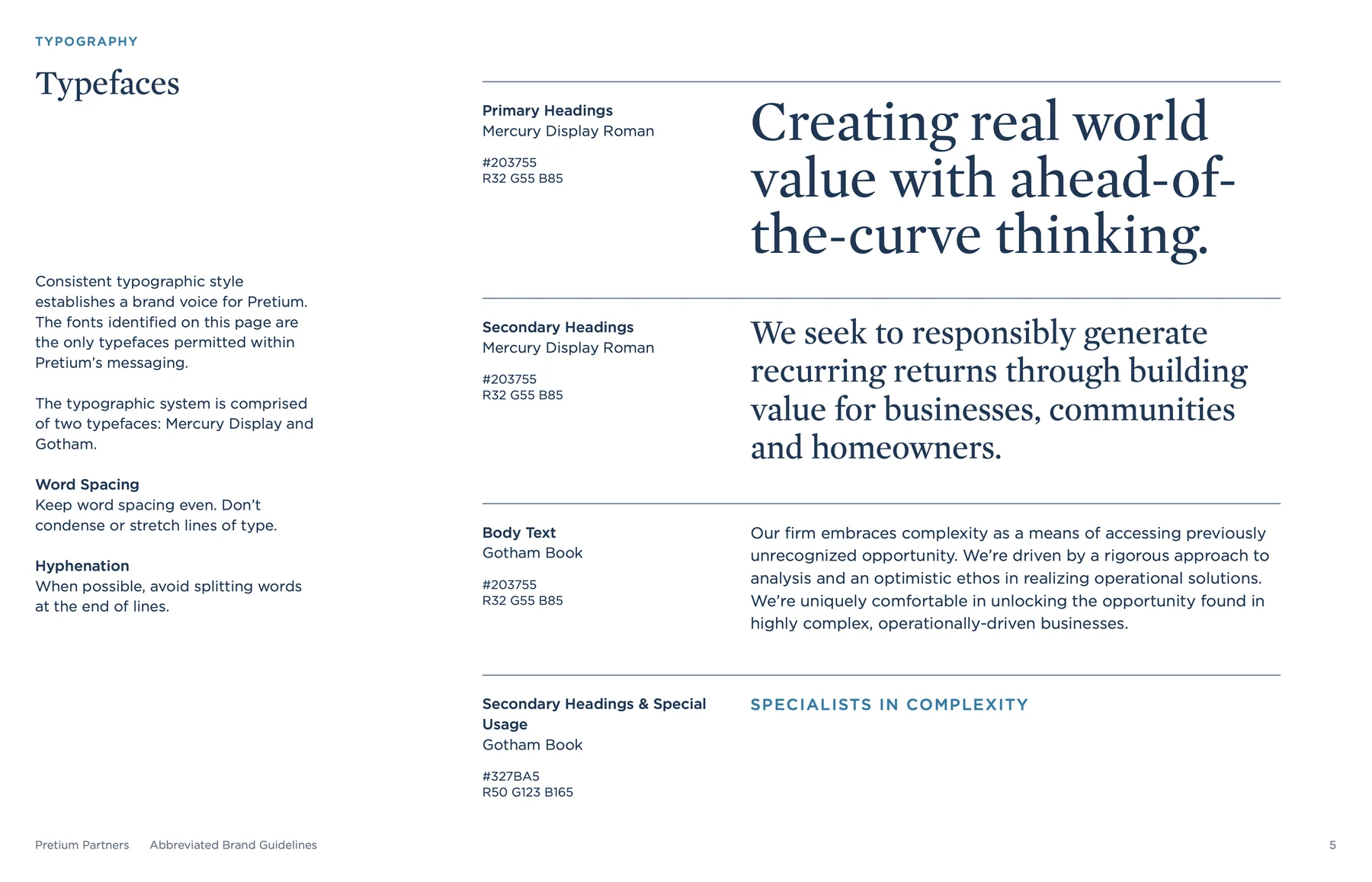
Within the wider agency engagement, I developed the identity into a practical visual system. Typography, color, icons, photography direction, and the prism pattern gave the brand a vocabulary that could adapt across formats. The guidelines brought those decisions together, with examples showing how the elements work in combination.

02 / The digital expression
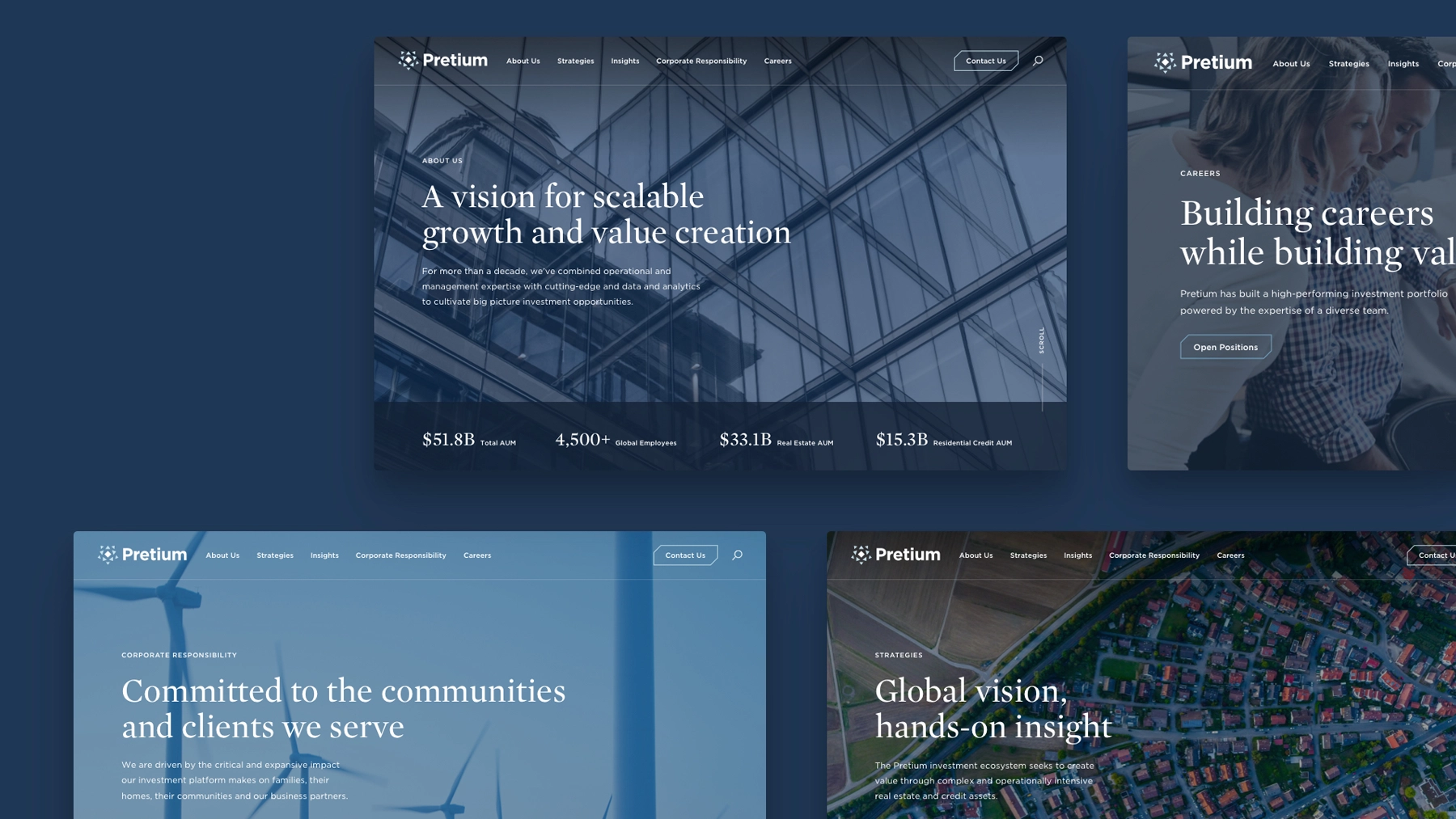
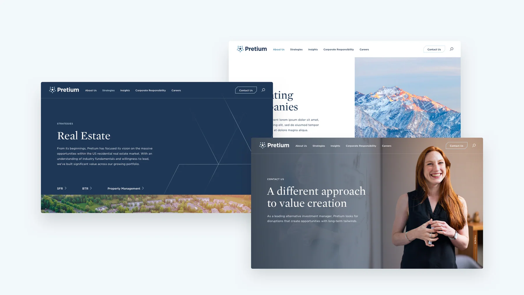
The website was a key place to bring the brand together. It had to introduce Pretium's point of view while giving its strategies, people, and operating companies room to be understood.
I carried the visual language into page layouts and interface details, including button styles, typographic hierarchy, and the relationship between imagery and content. The resulting designs show the same identity at different scales: an expansive introduction, a focused strategy page, and a more personal portrait of the people behind the business.
03 / The everyday tools
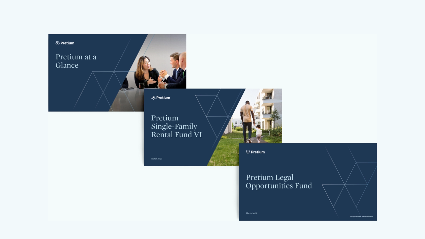
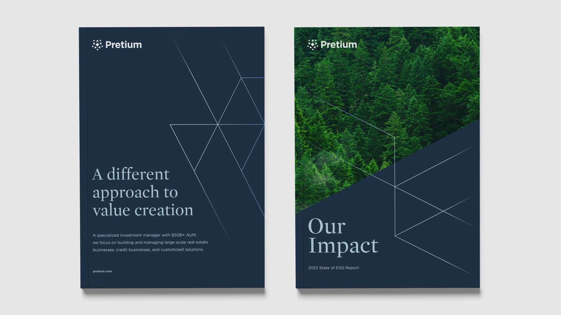
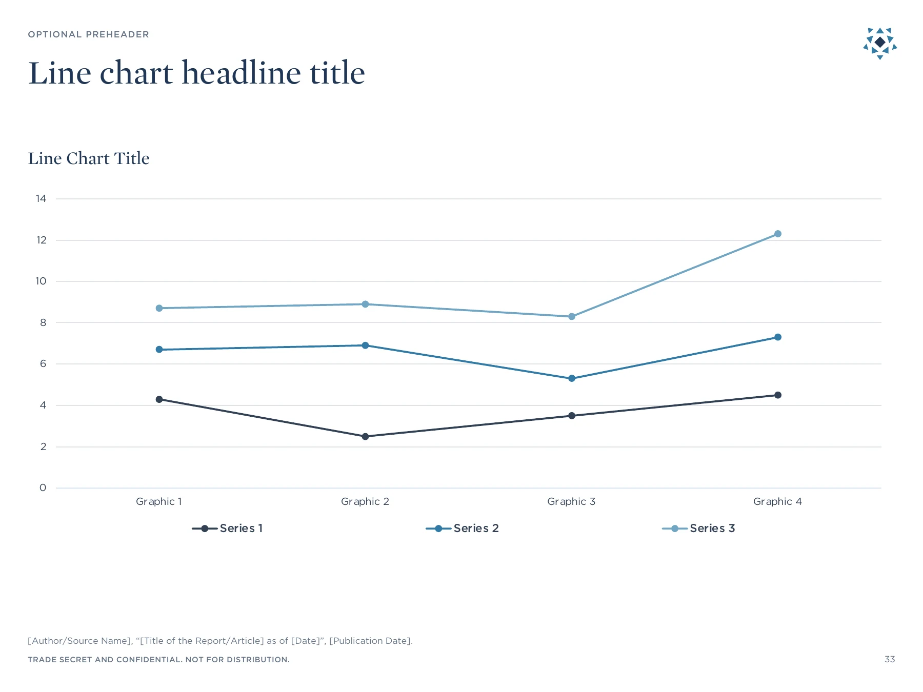
Much of a financial organization's communication happens in documents and presentations. Those materials needed the same attention as the public website, alongside the flexibility to handle changing content.
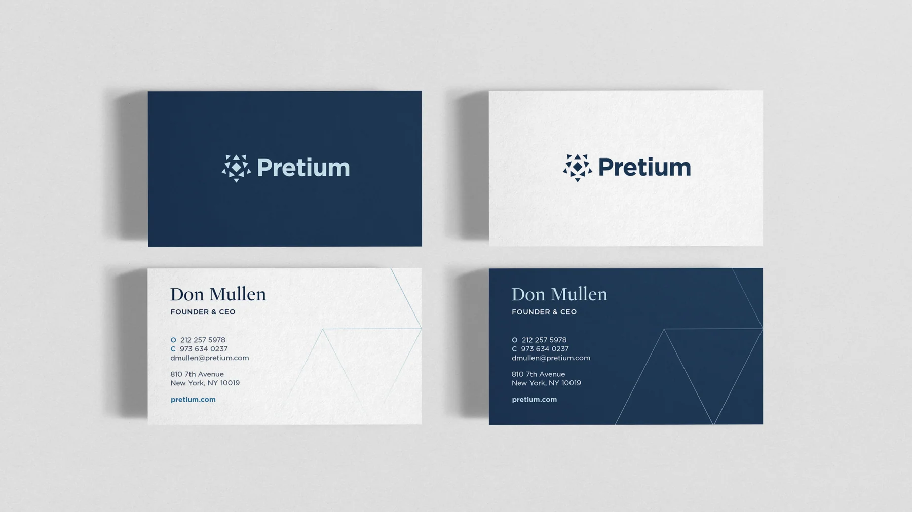
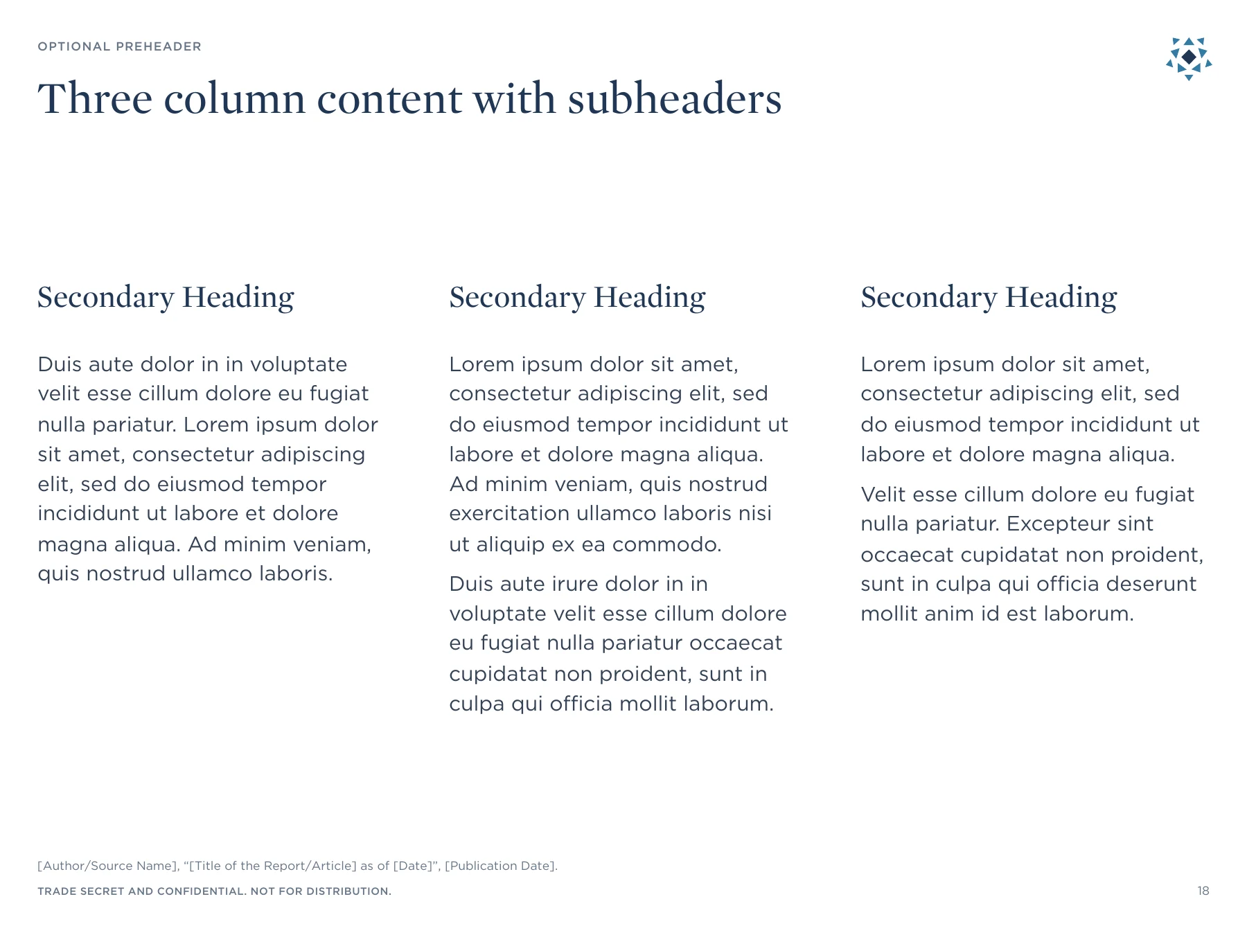
I built PowerPoint and Word templates, print reports, and business cards around the shared system. Carefully structured master slides made recurring layouts easier to update. The guidelines also addressed photography, headshots, icons, and data visualization, giving teams a reference for the many details that shape how the organization presents itself.
04 / Adoption and handoff
The handoff was part of the design work. I presented the new system to hundreds of Pretium employees, walking through the brand guidelines and demonstrating how the PowerPoint and Word templates were set up.
The training connected the visual decisions to practical tasks: choosing a layout, updating content, and working with the master slides. It gave employees a way into the system and showed how their everyday documents could carry the same identity as the website and other corporate materials.
The contribution
This work connected the visible brand to the tools behind it: a website, a documented system, reusable templates, and employee training. Its value lies in that continuity, from the design of an individual touchpoint to the way an entire organization can use the brand.
Created at North Street Creative as part of a broader collaborative agency engagement.
Artwork and mockups from the project archive.
Website imagery reflects the project period.
Next project / Selected work
All work

A sense of place, down to the smallest detail.
 Brand System
 Brand Experience
 Identity & Digital