
 All work
Featured case study
Building the visual system, practical tools, and operating model behind a complex healthcare brand.
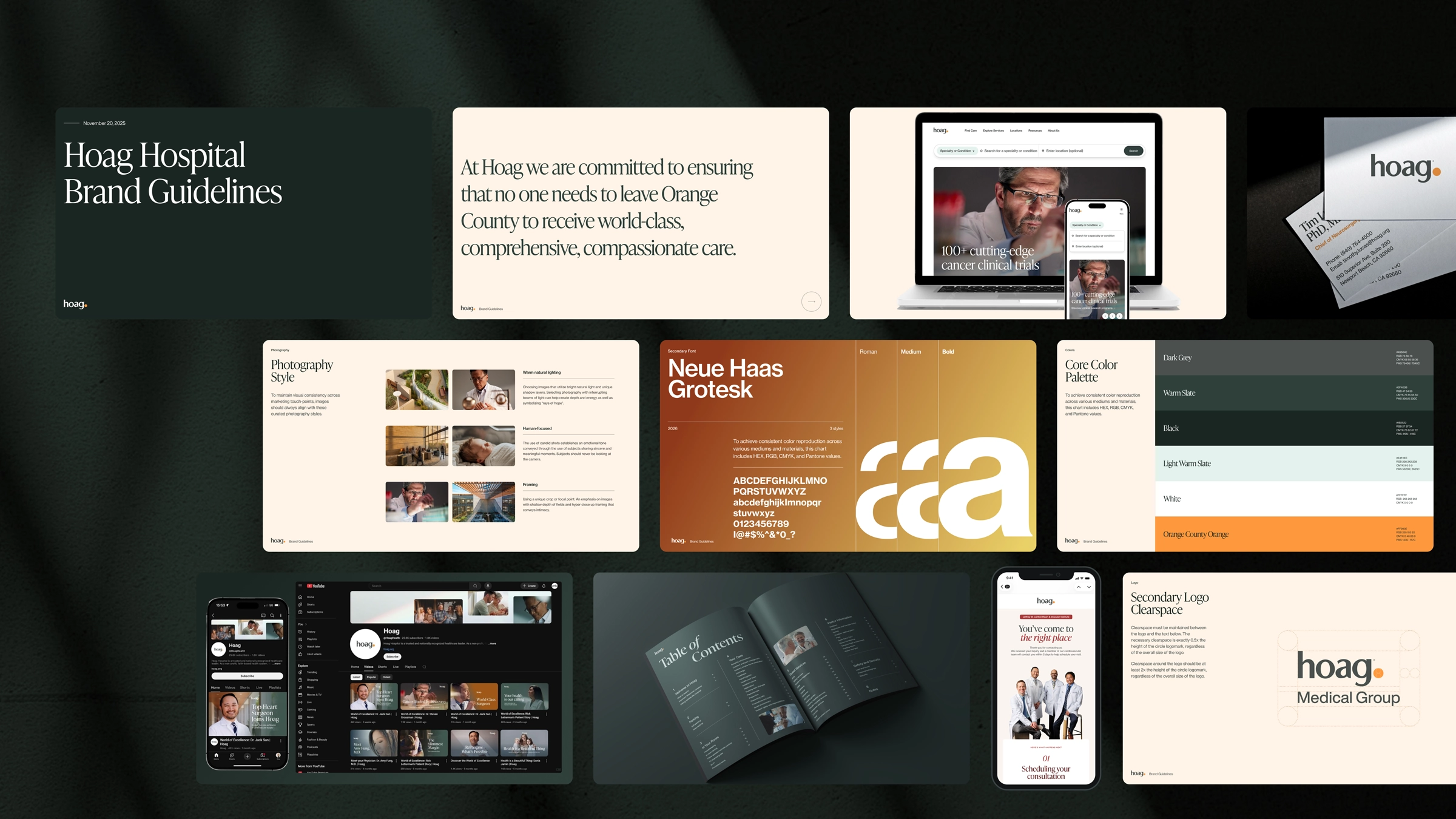
Hoag’s brand has to work across patient communications, institute campaigns, editorial storytelling, executive presentations, signage, and internal operations. I led the evolution of a shared system that brought those expressions together without flattening what each audience or moment required.
01 / Defining the foundation
Hoag's creative expression had to support very different moments without feeling fragmented. Institute campaigns, service-line communication, editorial work, events, patient materials, and internal presentations all needed enough consistency to feel unmistakably Hoag and enough flexibility to work for their audience.
I established a more deliberate relationship between color, typography, and hierarchy and created a consistent logo architecture. Those decisions became practical standards and a shared framework teams could use to create and evaluate the work.
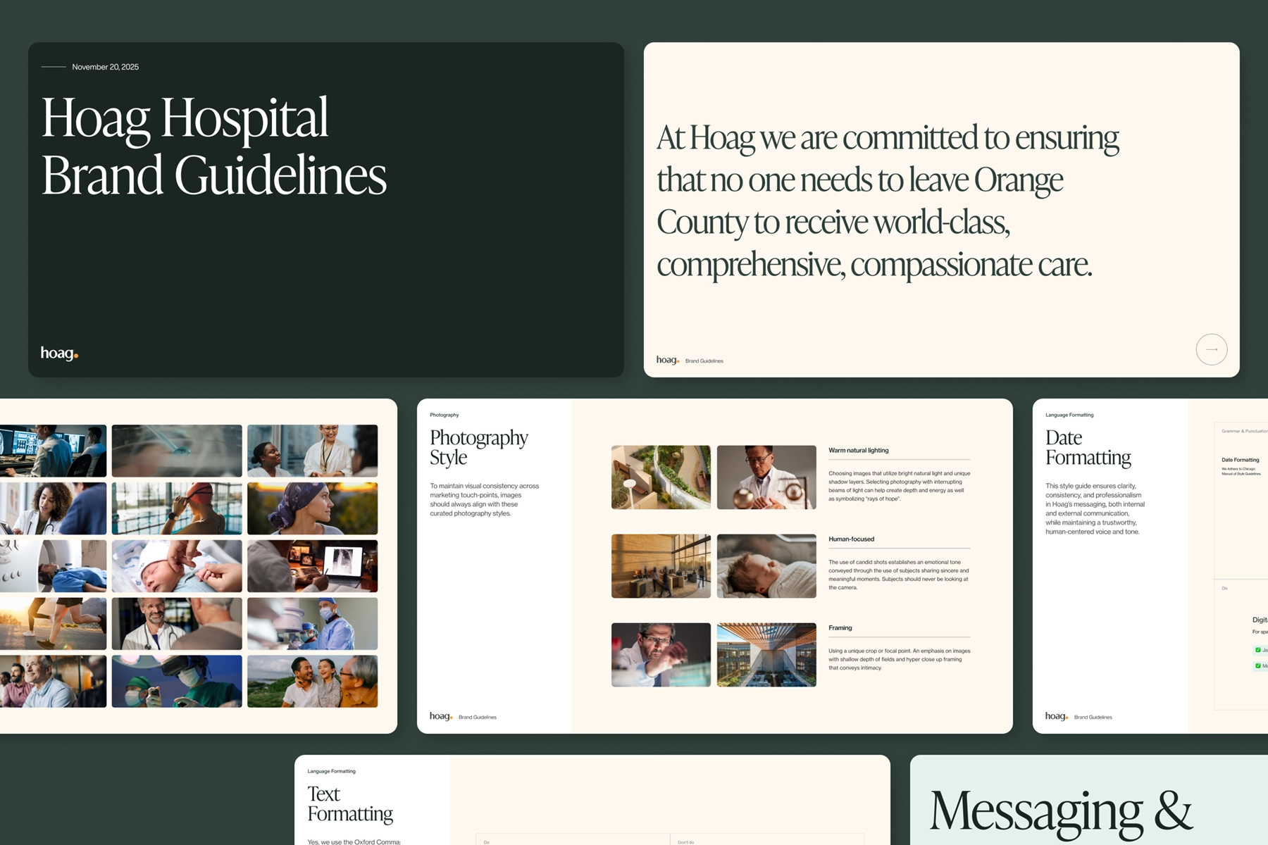
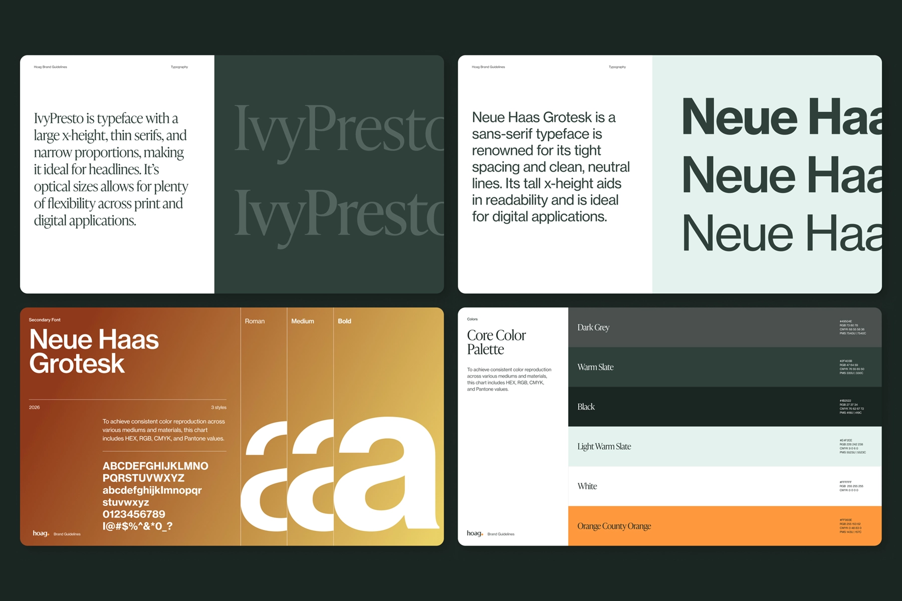
The brand needed enough consistency to feel unmistakable, and enough flexibility to support a large healthcare ecosystem.
02 / Extending the system
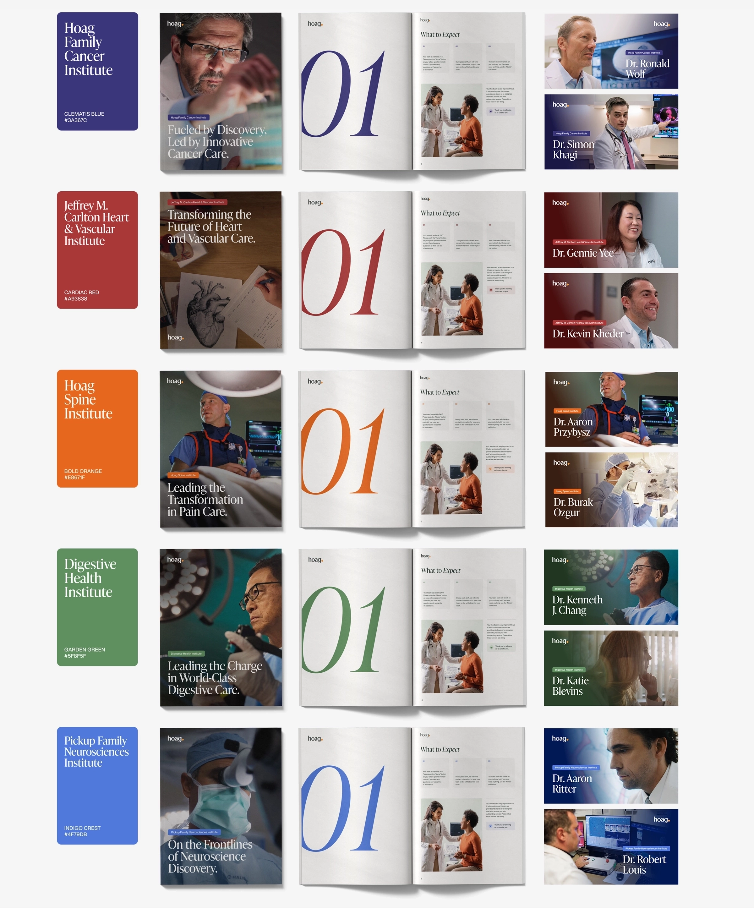
I implemented a distinct accent color for each clinical institute, extending Hoag's core palette while preserving a clear relationship to the parent brand.
For patients, the colors create a faster visual cue in a sea of media and materials. For internal teams, they create more room for expression while keeping every communication visibly connected to one organization.
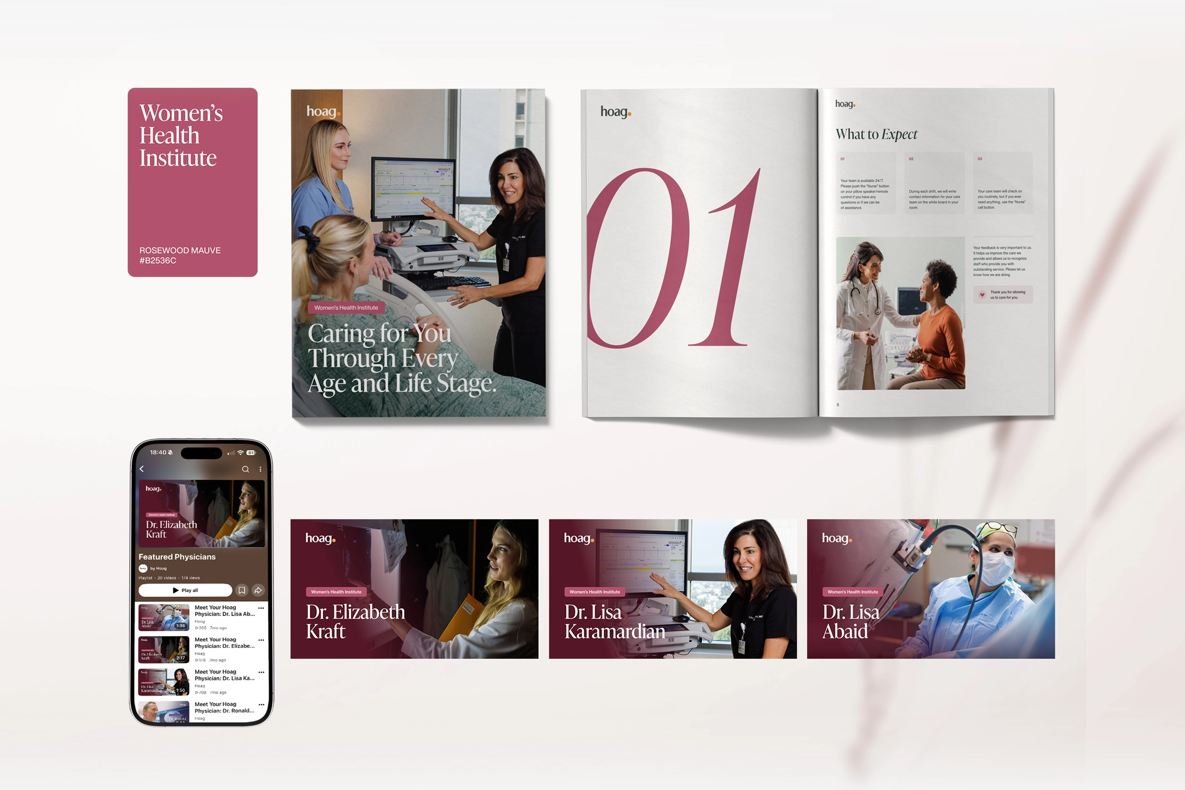
The goal was not to make every touchpoint identical, but to make every touchpoint feel like it belonged to the same organization, with the right amount of expression for the moment.
03 / Equipping the teams
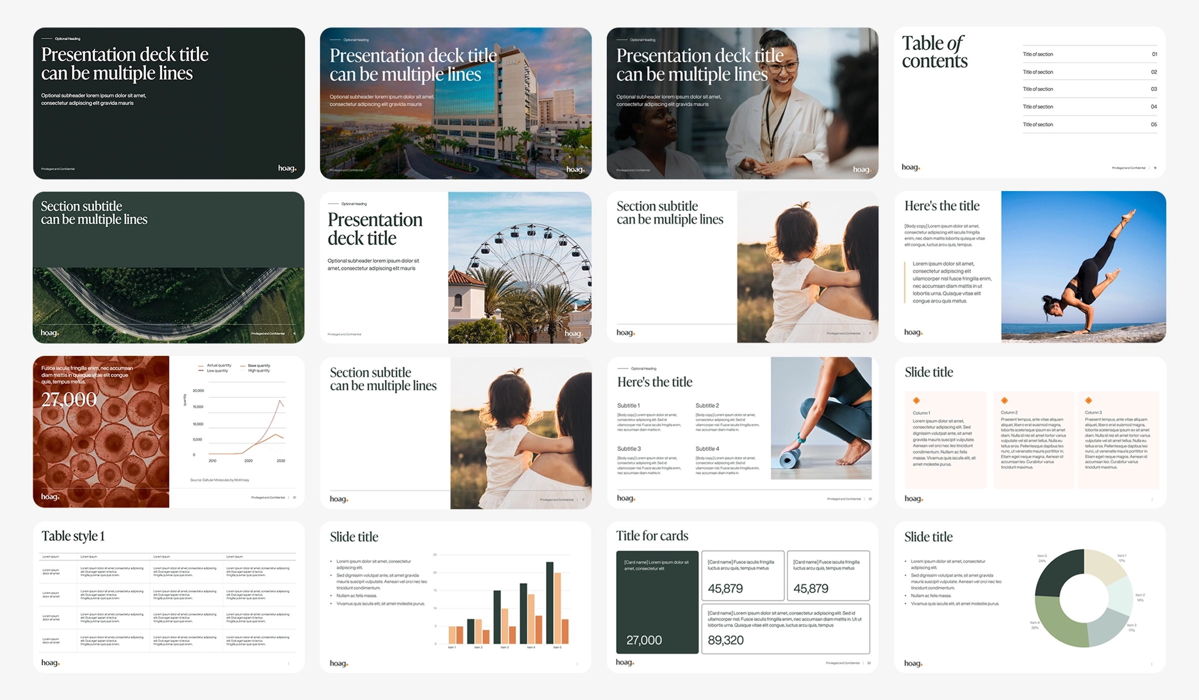
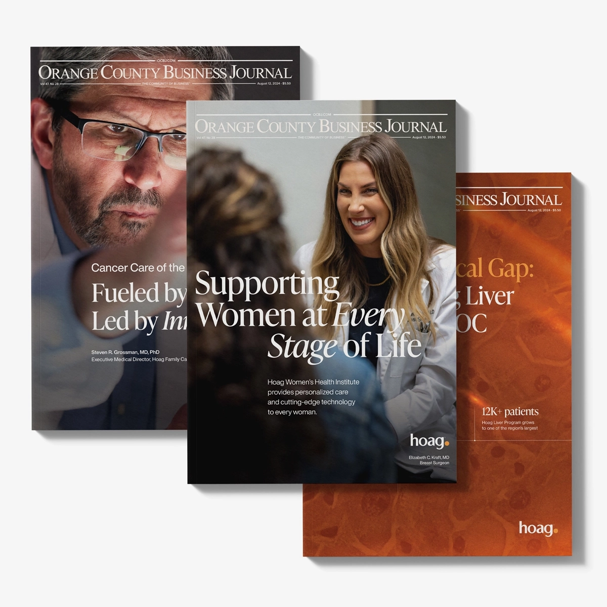
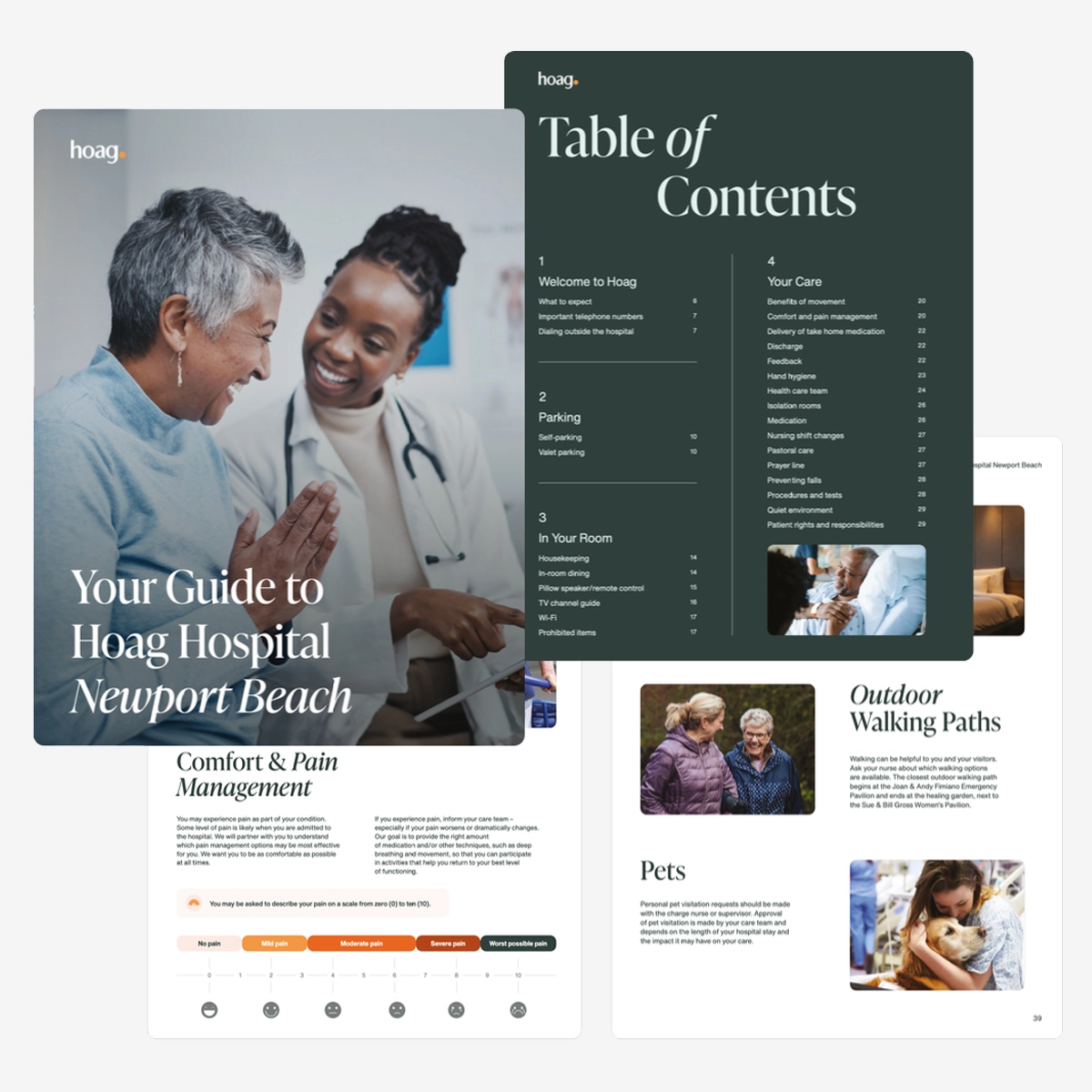
I translated the standards into practical tools for presentations, signage, publications, patient materials, advertising, email, and everyday collateral. The aim was to reduce reinvention and make the right brand decisions easier for internal teams and external partners.
Where communications needed to connect people with a next step, I introduced QR codes and trackable URLs that created clearer routes to information and a stronger foundation for measuring engagement.
Consistency became less about oversight and more about giving teams the right tools from the start.
04 / Improving the process
I designed a clearer operating model for creative work that included shared standards, reusable presentation tools, a more consistent review rhythm, and structured intake for recurring needs.
Shared standards and decision rules
Reusable templates for recurring needs
A clearer review and feedback rhythm
Structured intake, ownership, and delivery
In 2026, I implemented Asana across the marketing department, creating a more organized foundation for briefing, reviewing, and delivering work. The operational system made consistency easier to maintain by giving teams shared tools, defined ownership, and a more consistent process for moving work forward.
The outcome
The work established a more coherent visual language, practical tools used across the organization, and a more structured operating model for creative work. My role extended from setting the direction to building the standards, workflows, and decision structures that helped teams carry it forward.
Next project / Related case study
All work
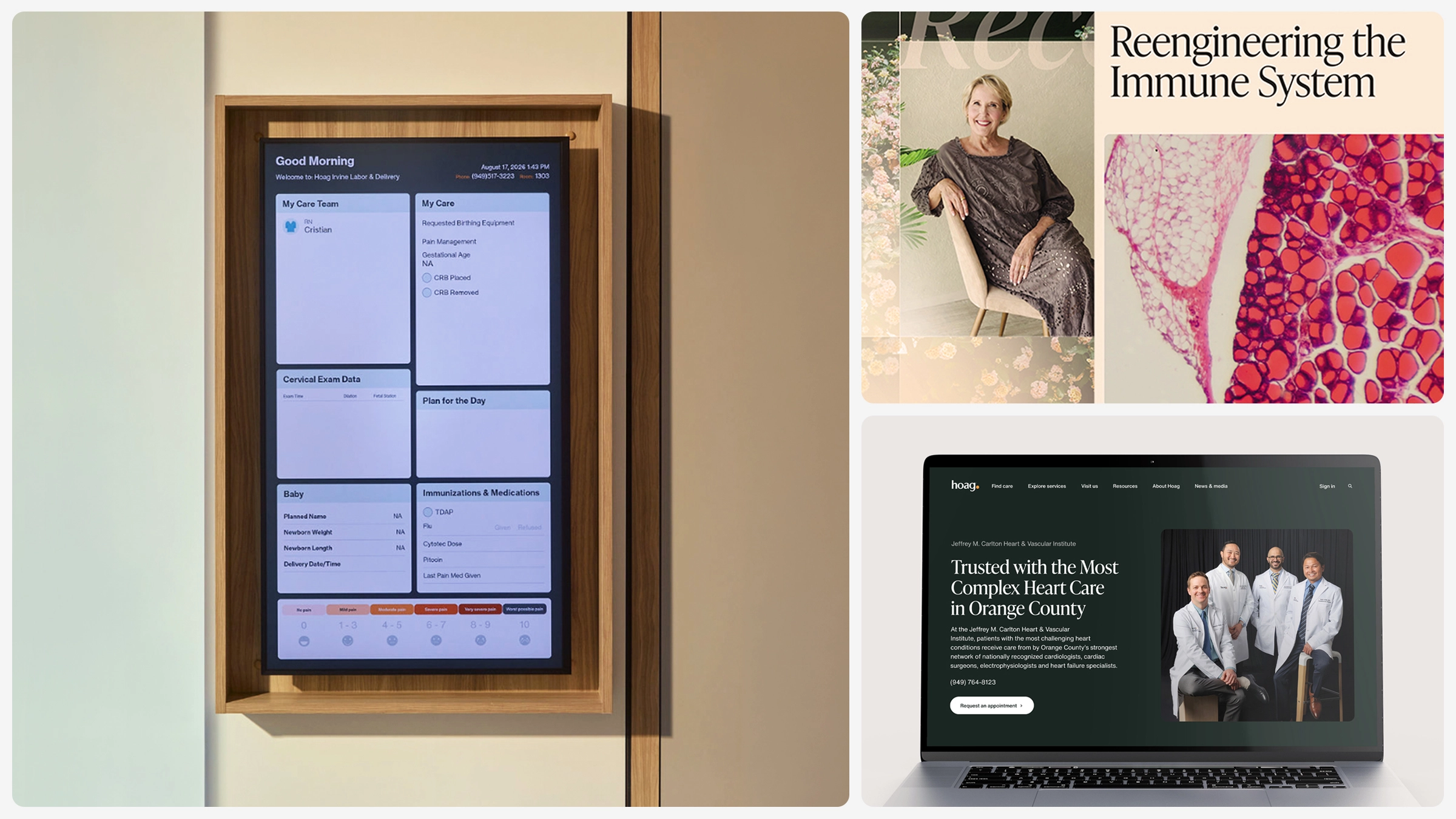

See how the system carries into communication, environments, and care.
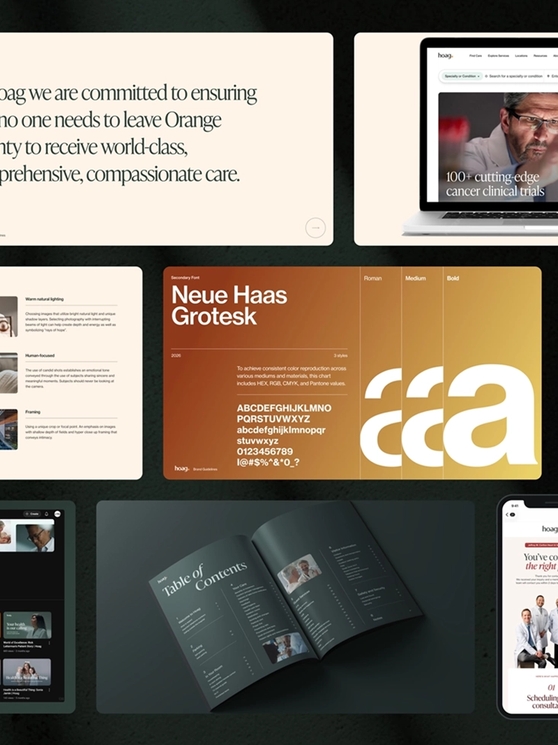 Brand System
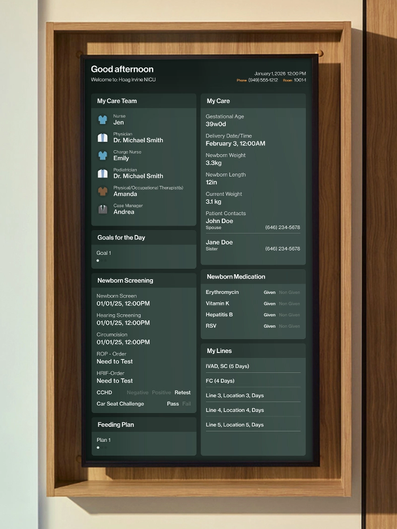 Brand Experience
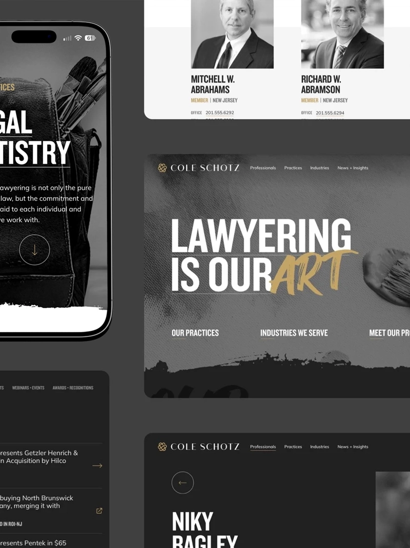 Identity & Digital